Wednesday, October 29, 2008

McCloud Comics Pt. 1

(Edited 11/03 to fix links, typos, and add an image. -RT)

I just read 14 pages of THIS.

It's called "2nd Shift" by J. Gray.

I really didn't think that there was anything interesting to write about with this comic, but I'm too tired to go back and start searching again. I chose this one because I thought it was going to be about some kind of aliens working at a copy shop. That sounded great to me. No aliens as of yet.

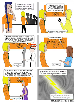
Luckily for me, I reached page 14. This page was the first one which interested me to any great degree. Oddly enough, it was the first page to encorporate a whole slew of neat comic writing techniques.

First off, we have narration on this page, not simply traditional dialogue. Most panels on this page have both dialogue and narration running simltaneously. McCloud talks about the "desperate device-ness" of the dialogue bubble (word balloon) and references some attempts to subvert it on page 134 of his Understanding Comics guide, and this comic uses an excellent creative solution here. In addition to the traditional dialogue bubble, the author uses a drawing of a torn-off page from a notebook with hand writing on it, rather than standard comic font text.

This is quite effective in communicating the tone of the words. The character we're watching perfrom the action is almost interpreted as a background to the narrator's notes. While the "handwritten" notes are on the bottom of each panel, they're interpreted as the foreground of the panel.

I also found this to be the most compositionally interesting page of the comic. If we look at the first panel, we see the figure on our left hand side in the foreground, is logically much taller than any of the other figures and her line of sight is fixed towards the bottom right hand side of the panel. since the figure on the right hand side is in the background, he is smaller and less "weighty" composition wise. Intelligently, the author has repeated the figures form in the line of customers to the right. This helps balance the frame.

The second panel is excellently symmetrical. Equally sized figures stand on either side with dialogue on the top center and narration on the bottom center. If feels like a nice, square box. This compositional style follows for the next three frames until the last frame, which mirrors the composition of the first frame where a line of weight implied from top left to bottom right. In the final frame, the artist actually draws a lightning bolt reinforcing the line.

The last frame is also an anomaly so far in the comic in that is isn't a drawing of two people having a conversation. There is a break in the linear narrative which signifies a momentous change on the horizon. We'll see how and if that comes to fruition.

This page also functions most effectively as a self-contained, active narrative.

The characters and background artwork is what McCloud would call, "Cartoony" which leaves more room for the reader to superimpose themselves or their impressions onto the characters, rather than focusing on the beauty of highly-stylized artwork.

Scott McCloud, in his book, Understanding Comics, discusses the different impacts of various drawing styles. He states that the more simplified, iconic and "cartoony" the character is, the better the reader is able to project his own image onto that character, whether that image is the reader themselves, or a person imagined by the reader. If the character is drawn more detailed and realistically, then there is less room for the reader to fill in the gaps with their imagination. Thank you for pointing out that I didn't explain that at all!

Also, here is a screen shot of page fourteen, the page I wrote about, just click on it for a larger view. Enjoy!
Sunday, October 26, 2008

Picturing Texts on the Web

This site is a little different from what a person might expect to run into or a few reasons.

1. It doesn't try to sell you anything, at least not overtly.
2. It uses virtually no text, making it available to people regardless of their language or literacy.
3. The visitor has to be a little creative and curious in order to get to all the content, rather than having the content be as obvious as possible. For example, doing the same thing repeatedly often yields different result, in direct contrast to the popular mantra that repeating the same act but expecting different results is the definition of insanity.

Much like the road sign or airport security poster, this site utilizes (fairly) universal iconography to entertain and stimulate the viewer.

Can you get the Spaceship Tramway car to work? It can be done. And each step along the way is fun and surprising!

If you want to check out more of this stuff, here's the home page.

Friday, October 24, 2008

Peer Review Recap Pt. 2

I haven't uploaded my essay yet, so there hasn't been any peer review.

Tuesday, October 7, 2008

What Would the Community Think?

Will's blog sums up a couple of my main reactions. The book is dense. There are many concepts which require more than a single cursory reading in order to apply them to my own writing. Also, I feel especially critical of my writing, especially because I know it's being read by at least one person who has read or is reading Williams' book. I have deleted several words and changed others in an attempt to make this post as concise as possible, and in doing so have erased much of my own voice from the entry, and consequently diminished my sense of ownership of it.

Several classmates noted the difference in format between the two books, which effects both how the information is (or isn't) absorbed, referenced and utilized.

I agree with Simone (if I understand correctly) that Strunk and White are far more pleasant to read and access. I would be more comfortable reaching for Elements of Style if I had a question or concern, but I think the two books need to be used in conjunction, big picture conceptual stuff (Williams) and detail oriented guidelines (Strunk and White).

Monday, October 6, 2008

Williams vs. Strunk & White


I'm almost bitter about having read so many awful, cruelly long and self-indulgent sentences.
The adult in me says, "Great, now you can stop the cycle of abuse.", but the petulant youth in me says, "Make them all pay, you had to read it, so you should have the freedom to do it yourself if you like." Then the rational, scrupulous voice in my head says, "What would be the point?, sure you could write annoying sentences which fulfill that occasional impulse, but why?"

I was about to say that it's more fun to write sentences with rigid structural rules, but....it isn't.
If you must first write a "no holds barred" draft in order to keep your ideas coming, do it! But don't be afraid to spend a great deal of time restructuring and re-writing afterwards in on order to bring the readability of your end result up to the level of your ideas.

I suppose the advice in The Elements of Style are much, much easier to follow whereas Williams' in depth look at readability can be overwhelming and even annoying. I would never recommend sitting down and reading the entire book. What I think works better is the format we've been using to get through this book. Reading a few chapters and then discussing them. I would actually prefer to have stopped and discussed each chapter or section, but I recognize that this is impossible and impractical in our class.

Strunk and White ma have been grumpier, older men, but that actually helped make the book more entertaining. I would say that Williams' book is far better, more useful and more in-depth, but also harder to use.

Revising with Williams


I didn't find anything in these chapters that I could not see myself putting to use at some point in my writing. Not everything felt like advice I could have benefited from in the past, and not everything sounded as thought it had been catered specifically for the type of writing I am likely to do in the future. More importantly, each of the topics are excellent food for thought and will help me think critically as a writer and to write with the reader in mind.

Some of my favorite bits were:

Building a cohesive paragraph:
Williams emphasizes clarifying your sentences not only by turning them into character-driven action phrases, but also by filling in context which you may take for granted, but other readers might not have the benefit of.

Each paragraph should contain an introduction in an appropriate place, such as the beginning, and then proceed to make its discussion.

Diffusing Strings:
By repeatedly using the best (most effective and accurate) words to describe the action in your sentences, you avoid confusing your readers by needlessly throwing in synonyms which will ultimately make it more difficult for your readers to absorb your meaning.